Chef
A social dining app where people host meals at home — identity, interface and the full booking flow, from wireframe to prototype.
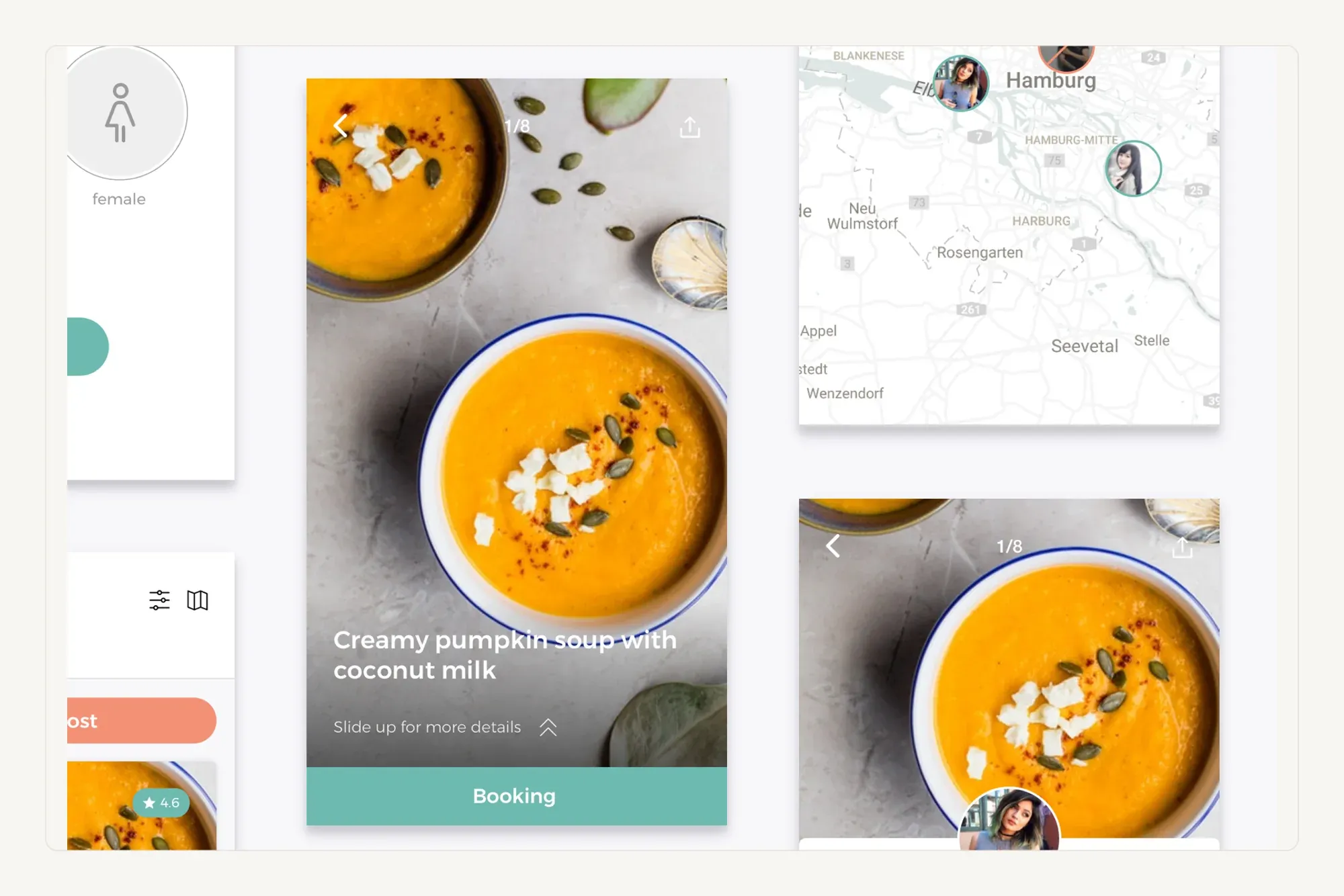
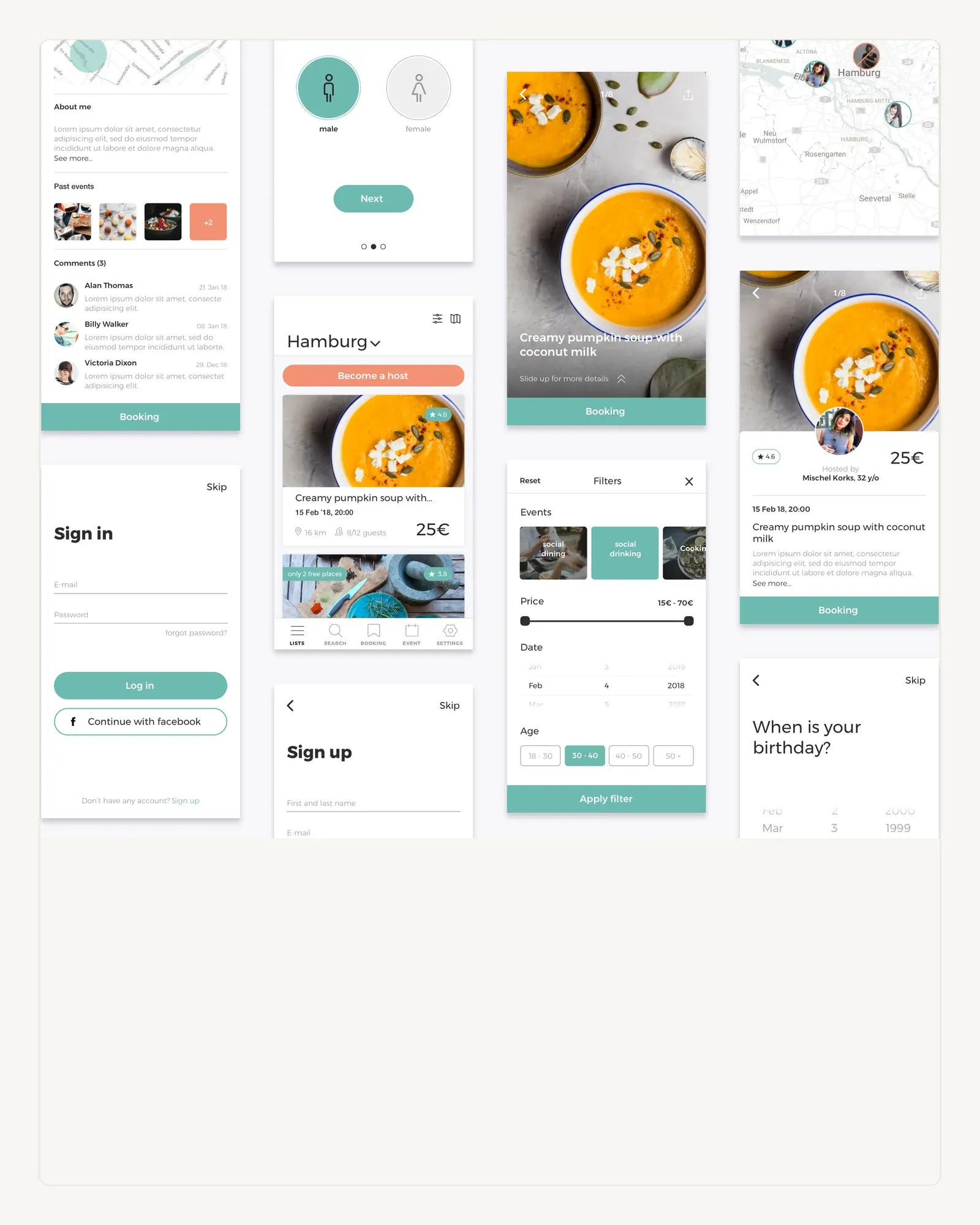
Chef is about eating at a stranger’s table. The design spends its budget on two things — making the food look worth booking, and making the booking itself feel unremarkable.
An identity that stays out of the way
The mark is a chef's hat, and it is deliberately obvious. An app about strangers cooking for strangers has enough to explain at the point of sign-up; the icon is not the place to be clever. A soft mint carries it, warm enough for food without competing with the photography.

Photography does the selling
Every screen in the browse and booking path gives the dish as much room as it can afford. Controls sit on top of the image or below the fold, so the food is what you scan and the price and host are what you check second.
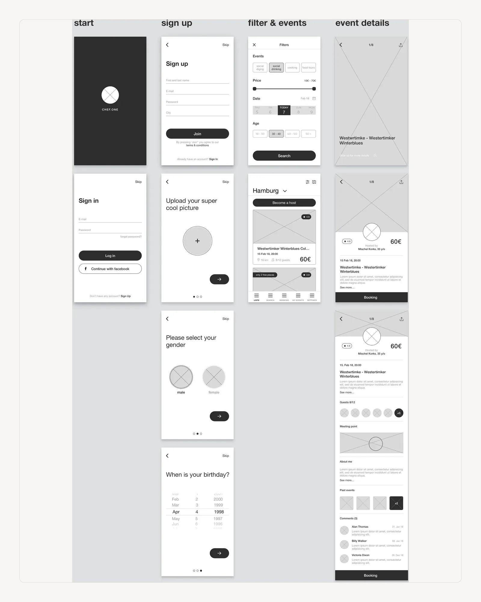
Wireframed end to end first
The greyscale pass covers start, sign-up, filtering and event detail as one continuous flow. Working the whole path through in grey is what keeps later colour decisions honest — if a screen only works once it is styled, it does not work.